Accordion Sections
Add collapsible accordion sections to your pages
Collapsible accordion sections can be a great way to help readers access the content of an otherwise long page quickly, or to tuck away content that might be an aside or sidebar to what is being said in the text. You can create these sections anywhere in a Quire project with the {% accordion %} shortcode. Also available is the {% accordionGlobalControls %} shortcode which adds “Expand/Collapse All” links to any page with accordions on it.
{% accordion %}
Parameters: <heading text>, <custom id>, <open>
{% accordion '## Section One' 's1' 'open' %}
  ...
{% endaccordion %}
{% accordionGlobalControls %}
Parameters: none
{% accordionGlobalControls %}
Wrap Content in the Accordion Shortcode
The {% accordion %} shortcode is a “paired” shortcode and so requires an opening and closing tag surrounding the text you want to be hidden.
Also required is a brief heading text that will become the link that expands and collapses the section. Markdown can be used in the heading text, and it will often be some level of heading. ## Section One is the heading text in the example below.
{% accordion '## Section One' %}
  ...
{% endaccordion %}
Markdown can also be used in the text within the section, as can shortcodes such as {% figure %} and even other {% accordion %} sections.
{% accordion '## Section One' %}
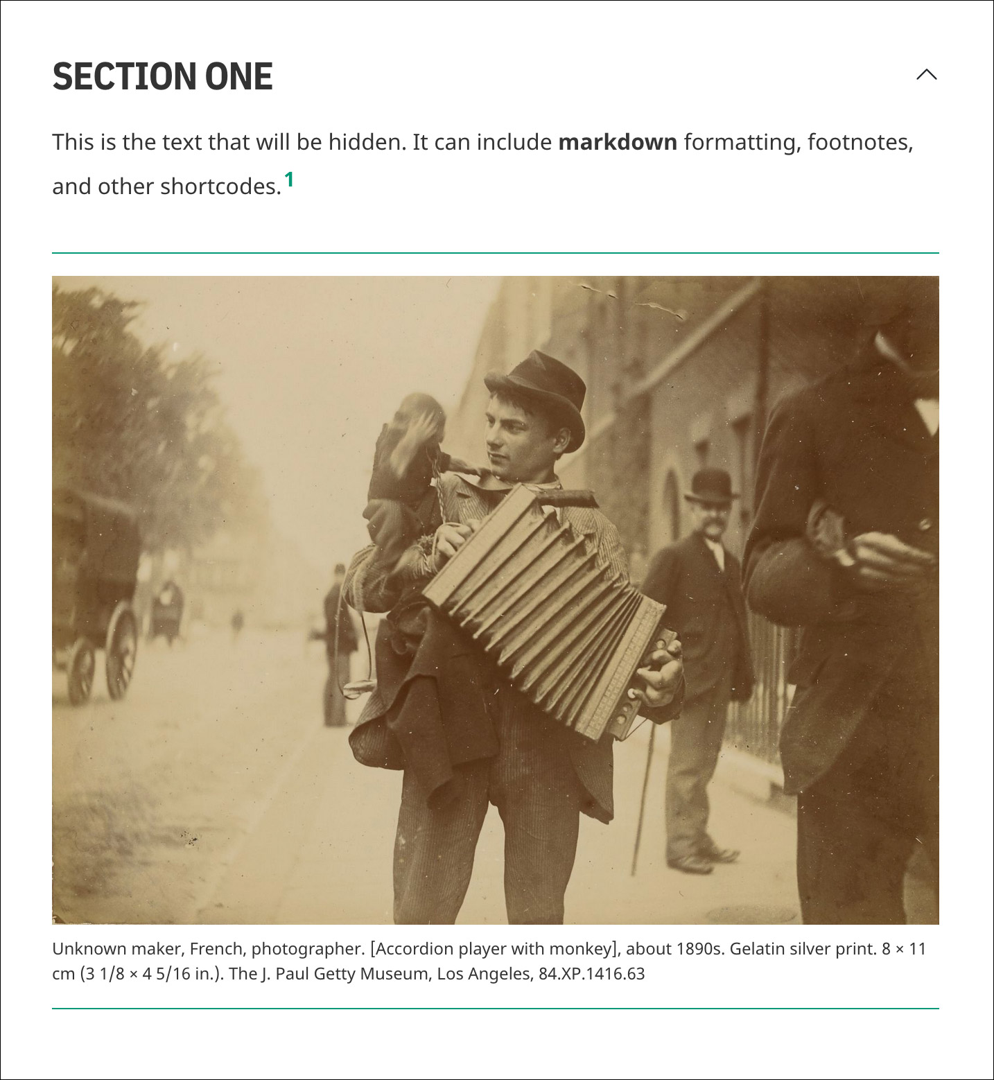
This is the text that will be hidden. It can include **markdown** formatting,
footnotes, and other shortcodes.[^1]
{% figure 'fig-01' %}
{% endaccordion %}
For web accessibility, an accordion should always have a visual indicator for its expand/collapse functionality. The icon used for this on each accordion section in Quire can be configured globally in the content/_data/config.yaml file. The icon can be either an arrow (the default) or a plus-minus symbol.
accordion:
  controls: arrow
Copy Links to Accordion Sections
When hovering over the heading and control icon of an accordion section in a web browser, a symbol appears to the left. This is the copy button. Clicking on it will copy the link for the section to your clipboard.
When visiting that copied link, the section will automatically open. (Accordion sections will also automatically open when following a link to an element within the section.)
The copy button symbol, tooltip text, and aria label (an accessibility feature that describes what the button does), can be configured in the content/_data/config.yaml file.
accordion:
  copyButton:
    ariaLabel: Copy page section link to clipboard
    successText: Copied page section link to clipboard
    symbol: §
The copyButton.symbol can be any unicode character.
Customize Accordion Link Names
By default, the URLs for accordion sections are generated from the heading text and prepended with #section-. For example, the link to the accordion in the example below, would be: https://my-publication.com/chapter-1/#section-comparison-of-historical-sources.
{% accordion '## Comparison of Historical Sources' %}
  ...
{% endaccordion %}
Section links can be customized by passing a custom id as an optional second parameter to the shortcode. This can be useful in streamlining otherwise long or unwieldy links for your users, or for internal linking within the project. The link in this new example would be much shorter: https://my-publication.com/chapter-1/#sources.
{% accordion '## Comparison of Historical Sources' 'sources' %}
  ...
{% endaccordion %}
- The custom id parameter should always be lowercase, be unique on the page, and never start with a number or include any spaces or special characters.
Set an Accordion to Be Open by Default
By default, all accordion sections will be collapsed when the page first loads. For any accordion sections you would instead like to be open when the page loads, you can add an “open” parameter.
{% accordion '## Section One' 's1' 'open' %}
  ...
{% endaccordion %}
Note that the parameters are positional (defined by the order they are given), and the “open” parameter needs to always be listed third, after the heading text and the custom id. If your accordion does not have a custom id, make sure the quotes are still there but leave them empty.
{% accordion '## Section One' '' 'open' %}
  ...
{% endaccordion %}
- In the PDF and EPUB outputs of your project, accordions will automatically be in their “open” state and will not show their controls.
Add Accordion Global Controls
You can add links to expand and collapse all the accordions on a page at once using the {% accordionGlobalControls %} shortcode. It can appear anywhere on the page though would typically be found directly above the first accordion section. And unlike {% accordion %} it is not a paired shortcode so needs no closing tag.
{% accordionGlobalControls %}

{% accordion '## Section One' %}
  ...
{% endaccordion %}
{% accordion '## Section Two' %}
  ...
{% endaccordion %}
The text for the global control links can be configured in the content/_data/config.yaml file.
accordion:
  globalControls:
    collapseText: Collapse All
    expandText: Expand All
Configure the Accordion Shortcodes
As noted in the sections above, there are several ways the {% accordion %} and {% accordionGlobalControls %} shortcodes can be configured. All the options can be found in the content/_data/config.yaml file.
accordion:
  controls: arrow
  copyButton:
    ariaLabel: Copy page section link to clipboard
    successText: Copied page section link to clipboard
    symbol: §
  globalControls:
    collapseText: Collapse All
    expandText: Expand All
| words