RECIPE. Tag Select Pages in the Sidebar with a Custom Icon
There are at least a couple of users in the Quire community who have customized their projects to display a custom icon in the sidebar menu to indicate the special status of a particular page. For instance, if that page includes extra research materials, or it’s an article that has been peer reviewed.
This is something you can do too, and we’re going walk through the steps here. In brief, they are:
- Add your custom YAML value into the global page data
- Add a new SVG icon into your project
- Customize the menu item to include the icon when the YAML value is true
- Style how the icon appears in the menu
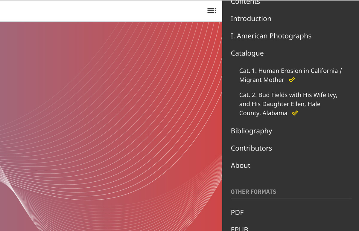
peer_review: true in the pages’ YAML.1. Add your custom YAML value into the global page data
The YAML value you choose can be anything you’d like, but to make it available to Quire’s templates, it needs to be added to the computed, global page data. We’ll use peer_review as our example:
title: My Scholarly Article
layout: essay
order: 104
peer_review: true
To add it to the global data, go to content/_computed/eleventyComputed.js and around line 20, you’ll see a list of familiar looking page items. Add peer_review: data.peer_review, into this list, and save the file. It doesn’t matter where, though Quire tends to list things alphabetically to keep things readable. And just note that each line in this list is followed by a comma except for the last one.
data: (data) => {
  return {
    abstract: data.abstract,
    classes: data.pageClasses,
    contributor: data.contributor,
    figure: data.figure,
    image: data.image,
    label: data.label,
    layout: data.layout,
    object: data.object,
    order: data.order,
    peer_review: data.peer_review,
    short_title: data.short_title,
    subtitle: data.subtitle,
    summary: data.summary,
    title: data.title
  }
},
2. Add a new SVG icon into your project
So, you’ve got your data ready to go, you’ll next need an icon to add. You can use any icon you’d like, it just needs to be an SVG as you’ll be adding the code of the SVG right into the Quire templates, rather than including the SVG in your content/_assets/images/ directory like you would other kinds of images.
There are a number of good sources of free and low-cost icons, like:
Once you’ve identified and downloaded your SVG icon file, open it in your text editor. Here’s our example, an outlined checkmark from the Material Symbols set:
<svg xmlns="http://www.w3.org/2000/svg" height="20" viewBox="0 96 960 960" width="20">
  <path d="m395 771 339-339-50-51-289 288-119-118-50 50 169 170Zm1 102L124 601l152-152 119 118 289-288 153 153-441 441Z"/>
</svg>
For our purposes, rather than having everything wrapped in an <svg> element, you want it to be a <symbol> element. You can also go ahead and also delete xmlns="http://www.w3.org/2000/svg" and don’t forget to change the closing tag from </svg> to </symbol>. Here’s what we’re left with:
<symbol height="20" viewBox="0 96 960 960" width="20">
  <path d="m395 771 339-339-50-51-289 288-119-118-50 50 169 170Zm1 102L124 601l152-152 119 118 289-288 153 153-441 441Z"/>
</symbol>
With your SVG code ready, open _includes/components/icons.js in your Quire project. You’ll find a long list of different SVG icons, wrapped in <symbol> tags, that are used in different Quire templates. Copy and paste your new SVG icon into that list, and give it an id. The id MUST be unique among the other icons already there, and MUST end in -icon. Save the file.
<symbol id="checkmark-icon" height="20" viewBox="0 96 960 960" width="20">
  <path d="m395 771 339-339-50-51-289 288-119-118-50 50 169 170Zm1 102L124 601l152-152 119 118 289-288 153 153-441 441Z"/>
</symbol>
3. Customize the menu item to include the icon when the YAML value is true
You now have your page data ready, as well as your icon. The next step is to insert the icon into the menu list where you want it. Open _includes/components/menu/item.js. This is the file that controls what each menu item displays. Typically, the page label and title. (The whole file is only a couple dozen lines long and we’ll walk through each change to this file step-by-step, but the full thing is also reproduced at the bottom so you can compare the customized version to the default one.)
First, in order to add the icon in here, you need to load the filter built into Quire that creates the icon markup. You do that at the begining of the function, with the line const icon = eleventyConfig.getFilter('icon'). This creates a const (constant) called icon which is Quire’s icon filter.
module.exports = function(eleventyConfig) {
  const icon = eleventyConfig.getFilter('icon')
  const pageTitle = eleventyConfig.getFilter('pageTitle')
Second, you need to access to your new page YAML value from the global data. There is a line that defines the data constant, that already includes a number of familiar page YAML values. This is where you will add your YAML attribute, matching the one you added to content/_computed/eleventyComputed.js. In our example, we used peer_review, but because it uses an underscore, which Javascript doesn’t like, we want to also redefine the name of the attribute into snake case, or peerReview. We do that by adding it to our data list as peer_review: peerReview. If there were no underscore in our YAML name, we could just include it as is, like title. Once you’ve added your YAML attribute to the data constant as below, the function now has access to that value for the given page.
return function(params) {
  const { currentURL, page } = params
  const { data, url } = page
  const { label, layout, peer_review: peerReview, title } = data
Third, you want to create the icon to insert into the menu, but only if peer_review (peerReview) is true on the page. The “if…else” statement below says if peerReview exists (is true) then create an icon of a particular type with a particular description. Otherwise do nothing.
if (peerReview) {
  icon({ type: 'circle-checkmark', description: 'Peer Reviewed' })
} else {
  ''
}
The type value is the id you assigned to your SVG icon when you added it to the icons.js file (minus the -icon bit at the end). The description value is a short text of your choosing that should describe what the icon means. This text does not appear visually on the page, but will be available for visually impaired users who visit your site using screen readers and other assistive technologies.
The “if…else” statement can also be written that in a shorthand value and then its result assigned to a constant. Do that and add it to your item.js file as below. This means that the constant peerReviewIcon will either be an icon if the page was peer reviewed, or will be empty if it wasn’t peer reviewed.
  const titleText = pageTitle({ label, title })
  const peerReviewIcon = peerReview ? icon({ type: 'checkmark', description: 'Peer Reviewed' }) : ''
Finally, you add the peerReviewIcon to the HTML markup that is being returned in the template. It would go right after the titleText, and whenever you insert a constant into a string of HTML like this, you surround it with curly brackets that are preceded by a dollar sign: ${peerReviewIcon}. Without this additional markup, only the word “peerReviewIcon” would show up in your menu, not the icon itself.
return isPage
  ? `<a href="${url}" class="${currentURL === url ? 'active' : ''}">${titleText}${peerReviewIcon}</a>`
  : titleText
Here’s the complete, customized code for your _includes/components/menu/item.js file:
module.exports = function(eleventyConfig) {
  const icon = eleventyConfig.getFilter('icon')
  const pageTitle = eleventyConfig.getFilter('pageTitle')

  return function(params) {
    const { currentURL, page } = params
    const { data, url } = page
    const { label, layout, peer_review: peerReview, title } = data

    const titleText = pageTitle({ label, title })
    const peerReviewIcon = peerReview ? icon({ type: 'checkmark', description: 'Peer Reviewed' }) : ''

    /**
     * Check if item is a reference to a built page or just a heading
     * @type {Boolean}
     */
    const isPage = !!layout
    return isPage
      ? `<a href="${url}" class="${currentURL === url ? 'active' : ''}">${titleText}${peerReviewIcon}</a>`
      : titleText
  }
}
4. Style your icon
And finally, you’ll want to give your SVG some basic style rules. These should be added to your content/_assets/styles/custom.css file. Here, we’ve set the width and height relative the to the current font size (that’s the em unit); we added some left margin so it doesn’t rest agains the title type; we aligned it vertically; and colored it gold:
.quire-menu__list svg {
  width: 1.25em;
  height: 1.25em;
  margin-left: .5em;
  vertical-align: text-top;
  fill: gold;
}
The specific values can be adjusted/omitted as you like, for your particular icon.